“The simple, unsophisticated beauty of the lubok, the severity of the primitive . . . that is our password and our slogan" – Alexander Shevchenko (1913, 45)
The Lubok: An Illustrated Broadside
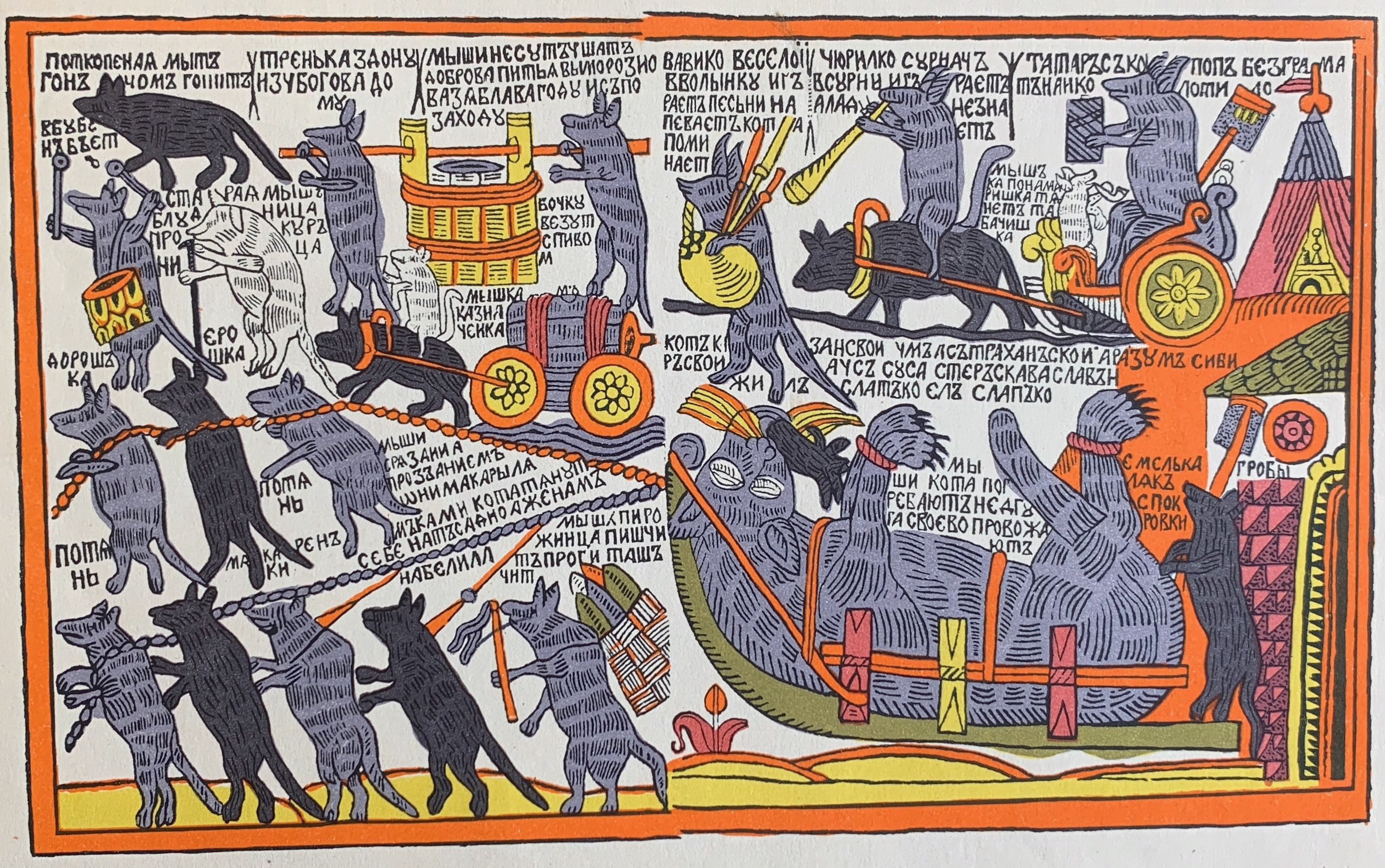
A distinctly Russian source of the illustrated children’s book lies in the Russian lubok (singular), or lubki (plural), usually defined as an “illustrated broadside” or “popular print.” Like other European countries, Russia had a rich tradition of cheap print and literature for the people. Often called “street literature” in English, these broadsides, chapbooks, and other ephemera served as a precursor to the popular press: Britain had its broadside ballads, Germany its Bilderbogen, and France its Épinal prints (Shepard 1973; Collison 1973; Hürlimann 1967, 152–55). The Russian lubok shares some characteristics with such Western “street literature,” yet also contains a uniquely Russian flavor, and greatly influenced the early twentieth-century Russian children’s book.
Back to Top of Page
Bast Pictures
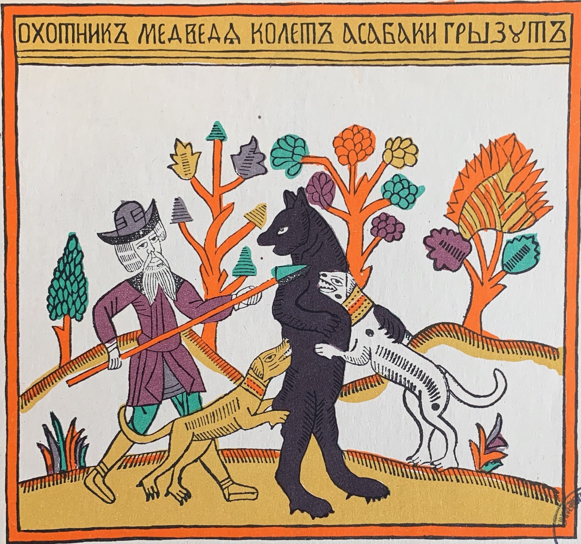
Scholars have long argued over the exact meaning of the Russian word lubok, but one likely explanation is that the word lub refers to the linden tree’s inner bark (cortex) (known in English as “bast”), which was used to create the linden-wood blocks on which images were engraved, and/or to the wood-blocks themselves. According to this theory, the word lubok refers to prints made from those engravings. The numerous competing hypotheses include the notion that the term lubok was derived from the bast-baskets from which lubki were sold, or even that the word is related to the location of the market where they were sold, Lubyanka Street (Mishina 1996, 19–21; Rudakova 2015, 3; Ovsiannikov 1968, 5–10).
While the term lubki is commonly used, these Russian broadsides have also often been called narodnye kartinki (“popular pictures [or prints]”; “people’s pictures”), narodnye graviury (“popular engravings”), prostonarodnye izobrazheniia (“common people’s pictures”), or lubochnye kartinki (“lubok pictures [prints]”). Mishina points out that the word lubok itself was not used for these pictures until the 19th century. In the early years (17th-18th centuries), they were sometimes called “comical sheets” (zabavnye listy), or simply named after their origin, such as “Suzdal pictures” (Mishina 1996, 15–28).
Back to Top of Page
The Lubok as Folk-Hybrid
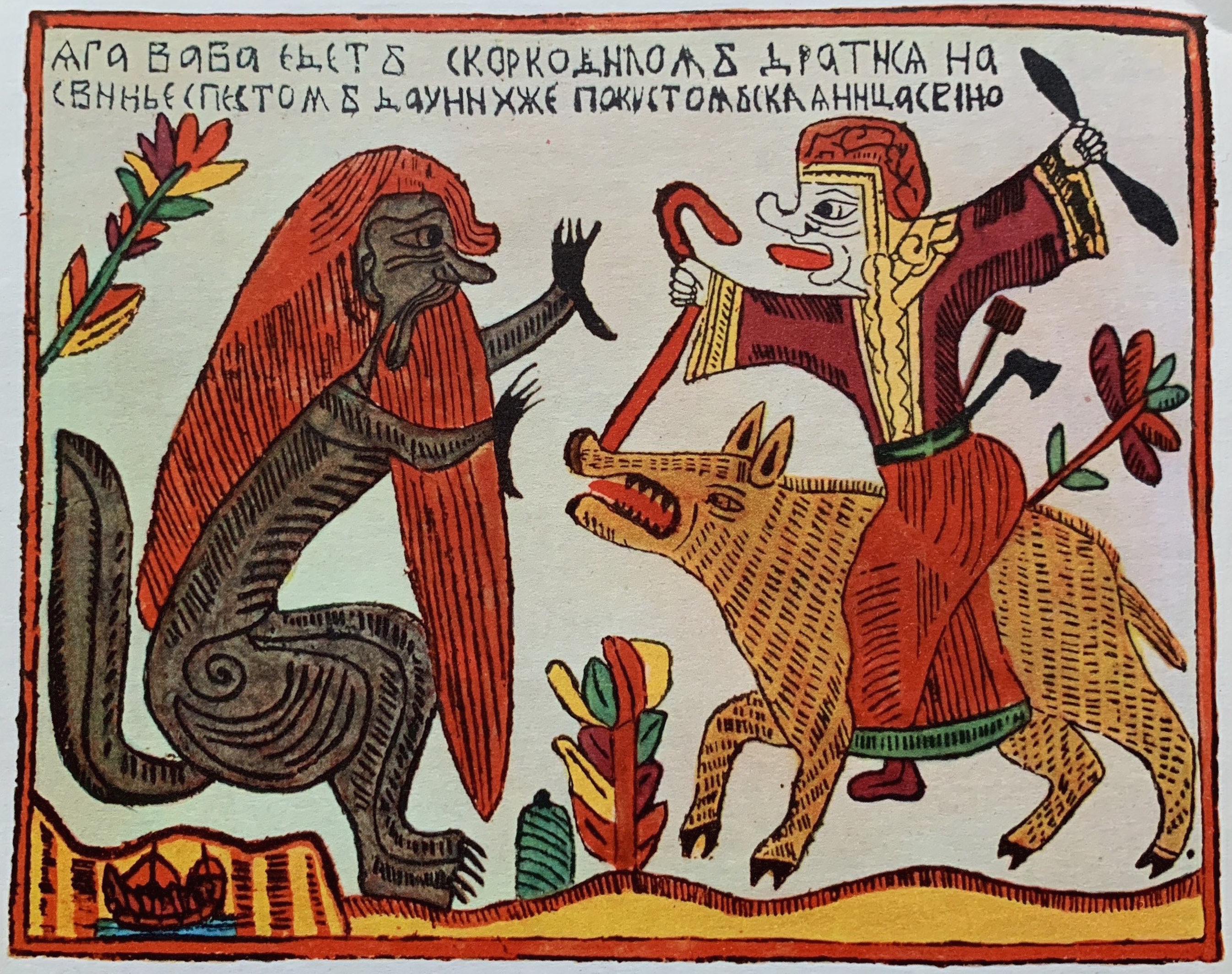
Another controversy regarding the lubok is whether it is strictly folk art or not. Some scholars locate the lubok within the nexus of folk art because the prints were usually anonymous, created by unknown craftsmen and self-taught artists, and peasant women often contributed to the hand-coloring. Others argue that lubki are not strictly folk art because they were often made by professional artists and sold to a broad range of social classes (Rudakova 2015, 3; Mishina 1996, 28; Brooks 1985, 65; Farrell 1980, 40–41; Hilton 1995, 107–8, 112). Alekseeva persuasively argues that the lubok could be considered a hybrid form that “borrowed from both folk and professional art, and developed independently” from both those traditions (1996, 12).
The audience for the lubki evolved over the centuries: although they were originally aimed at the upper-class elite, by the nineteenth century lubki were particularly popular amongst the rural peasantry, whose cottages were abundantly decorated with them. In 1810, Nikolai Strakhov defined the lubki as “a library for the people” (quoted in Nekrylova 2002, 11), and Brooks notes that the lubki “were often the first printed materials to enter the homes of the common people” (1985, 62–63).
Back to Top of Page
Origins of the Lubok
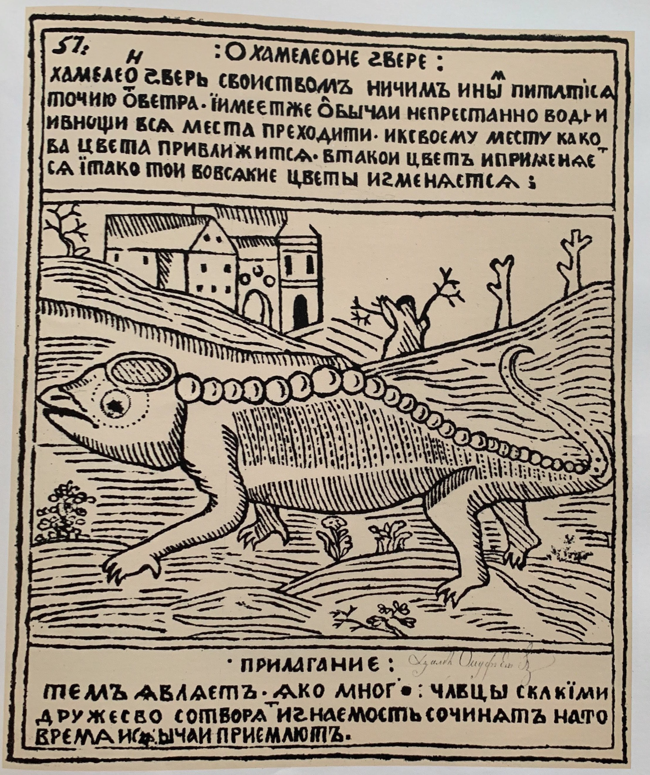
The roots of the Russian lubok lie in the early days of woodcut-engraving, which emerged first in the West, flourishing in the epoch of Albrecht Dürer (1471–1528), and then in Russia by the mid-seventeenth century. From the beginning the Russian lubok constituted an eclectic mixture of native and foreign traditions. Ukrainian engravers originally modeled their broadsides on Western editions of the Bible and Dürer’s engravings, but mixed these with iconographic motifs specific to Russian Orthodoxy. An important early prototype of the lubki was found in the woodcuts of Vasily Koren, an engraver who came to Russia from Byelorussia in 1661. Later Peter the Great encouraged the development of secularized and Western-influenced metal engraving. By the eighteenth century Russian lubki were highly prevalent, influenced by different styles simultaneously: a Muscovite folk-art woodcut style, Byzantine-style icons, secularized metal engraving, and diverse Western trends. This comingling of traditions created the unique style that distinguished the Russian lubok from its Western equivalents (Alekseeva 1996, 3–8; Farrell 1980, 20–27; Ovsiannikov & Shkarovsky 1968, 5–8).
Back to Top of Page
The Lubok as Popular Entertainment
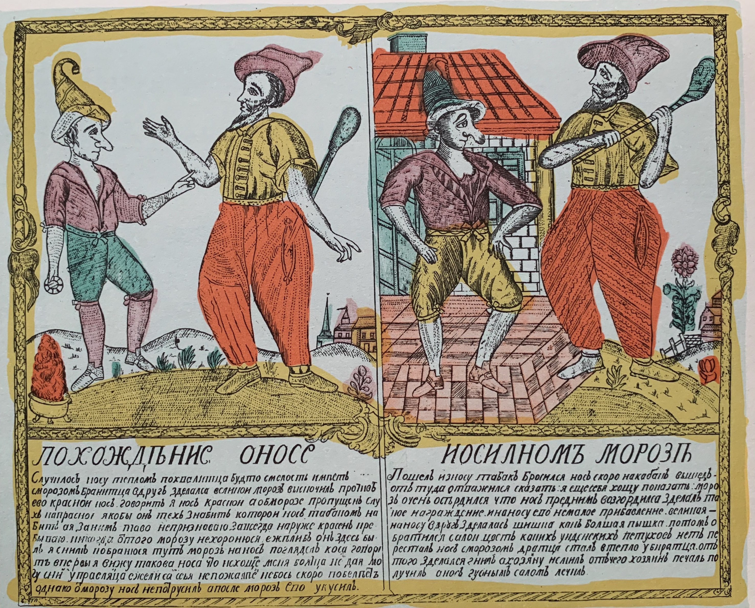
From these diverse roots and sources, the lubok soared to the height of its flowering in the second half of the 18th century, when it became its own distinct art form. It often served as a kind of illustrated newspaper or popular entertainment, overlapping with other genres such as poetry, fables, satire, devotional manuals, songs, and almanacs. Its topics ranged widely, including religion, fairytales, literature, social controversies, and politics (Alekseeva 1996, 9–10; White 1988, 2; Rudakova 2015, 10).
The earliest lubki were woodcuts, but in the eighteenth century copper engraving became more common, allowing the lubok to acquire a much wider audience, since printing of multiple copies was much easier from a metal plate. In the late nineteenth century, lithography took over as the principal means of reproduction, which allowed the printing of thousands of copies; this lowered the price, and increased the audience exponentially. Eventually the lubki began to be viewed disparagingly by the upper ranks of society, who saw them as coarse or vulgar, appreciated only by the lower classes.
Back to Top of Page
Brash Orange Hues & Medieval Style

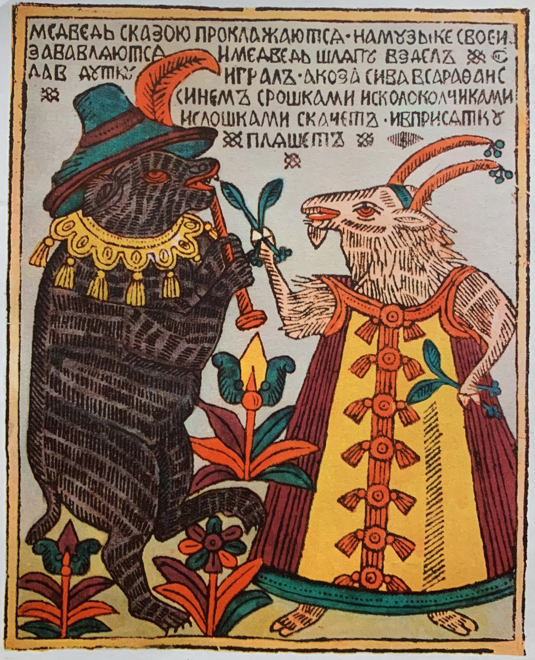
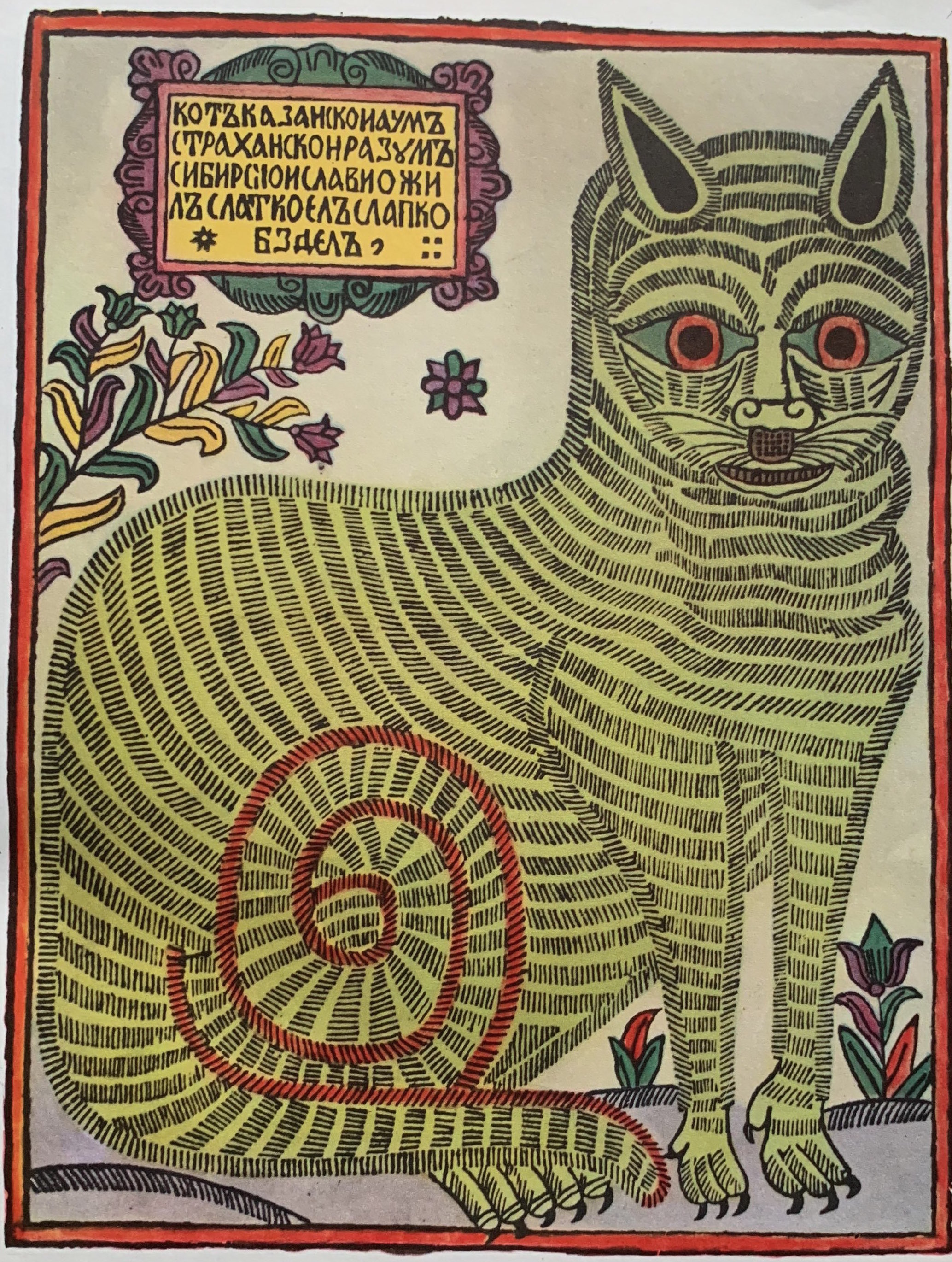
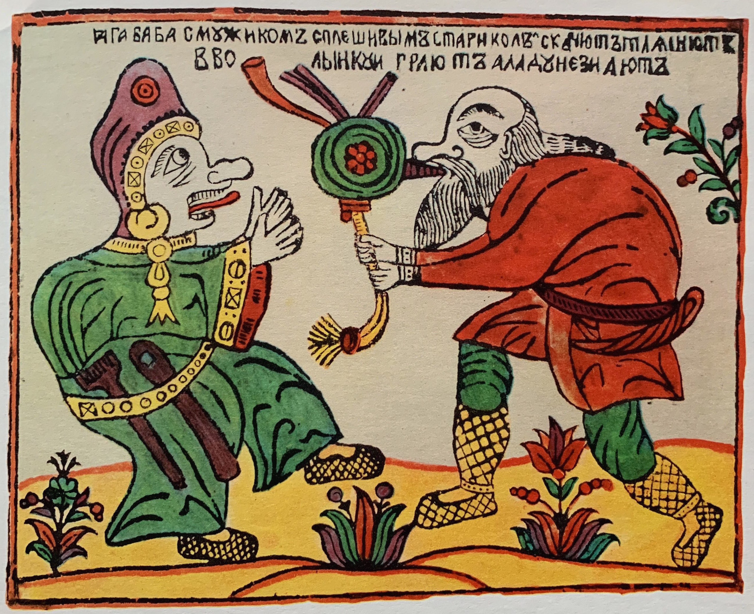
The lubok was characterized by numerous stylistic features that later proved influential on twentieth-century painters and illustrators. Simultaneously monumental and decorative, laconic and highly detailed, static and dynamic, the lubok was a contradictory art form, characterized by high-contrast, brash colors and a “deliberately crude stroke” (Ovsiannikov 1968, 6). Its ornate design and red-orange hues transmitted a “fantastic, festive, joyful mood” that evoked the world of both the epic and the fairytale (Alekseeva 1996, 9–11). With its spatial ambiguity, omission of shadows, and flattened, schematic figures defined by thick black contours, the lubok evoked a medieval sensibility. It also freely mixed multiple perspectives, showing objects from conflicting points of view, or combining episodes from different times into a single plane (Parton 1993, 7, 27, 82–84; Alekseeva 1996, 10).
Back to Top of Page
Carnivalesque Laughter of the Lubok
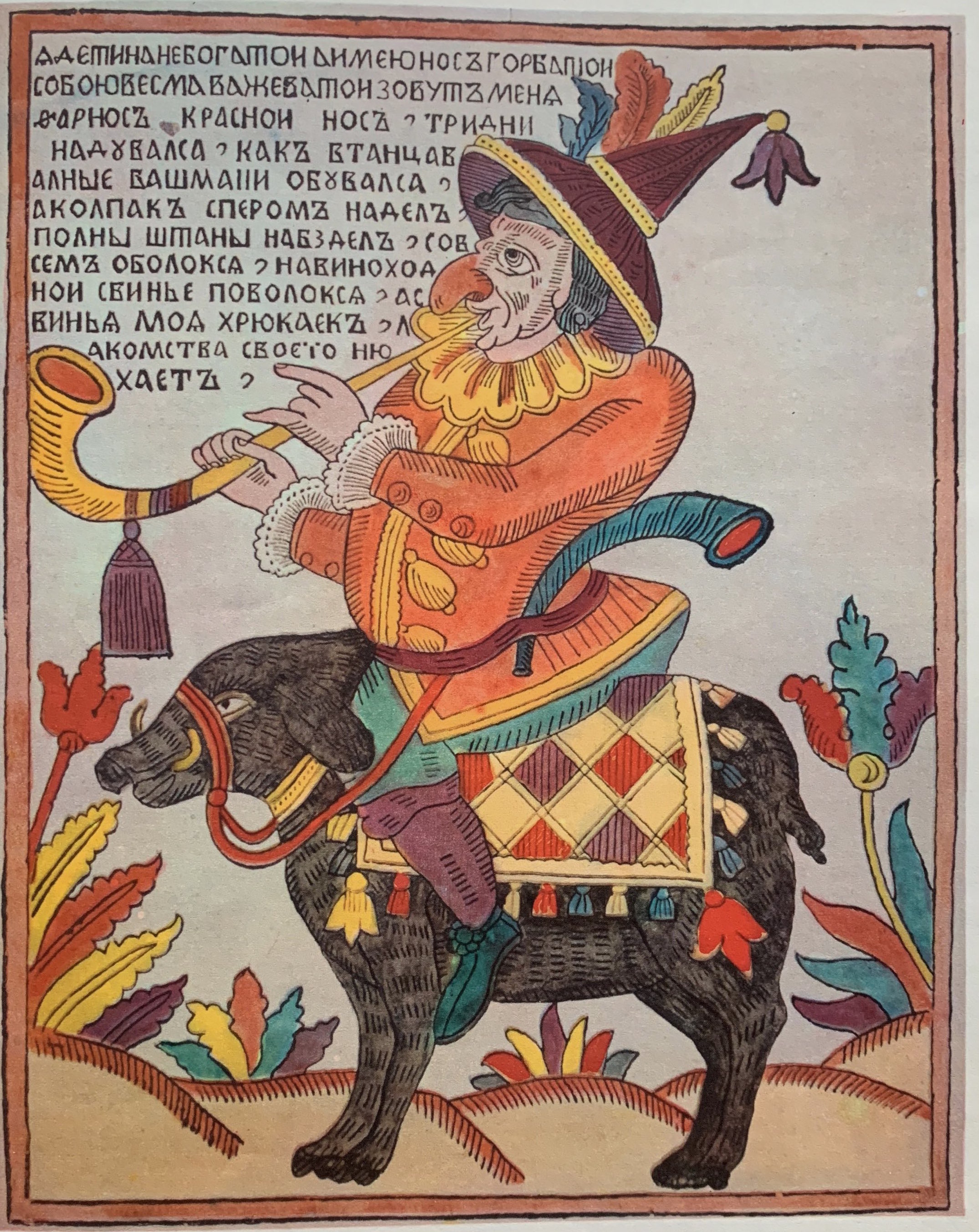
Another salient feature of the lubok was its festive humor, akin to the medieval “festive folk laughter” (narodnyi-prazdnichnyi smekh) that Mikhail Bakhtin later defined as “carnivalesque.” This laughter is unlike modern satire in that it is aimed not just at others but also at oneself: “Carnival laughter is the laughter of all the people.” Ambivalent in nature, folk laughter is both “cheerful” and “derisive” (Bakhtin 1990, 17; Bakhtin 1984, 11–12). Nekrylova likens the playful nature of the lubok to folk theater and slapstick booths at country fairs (2002, 13); the Western equivalent would include both commedia dell’arte and Punch-and-Judy shows. Sakovich suggests that the lubok functions as a “wall-mounted theater,” with figures assembled in the foreground (as if on the edge of the stage), framed by a thickly-outlined border that resembles a theater proscenium (cited in Nekrylova 2002, 13). One can also see a communal theatricality in the way the lubki were read and absorbed by the lower classes, as Strakhov noted in the nineteenth century: “In the evenings illiterate people gather round to look at them, while those who are literate read them out loud and explain what they mean” (quoted in Nekrylova 2002, 11).
Back to Top of Page
The Lubok in the Twentieth Century
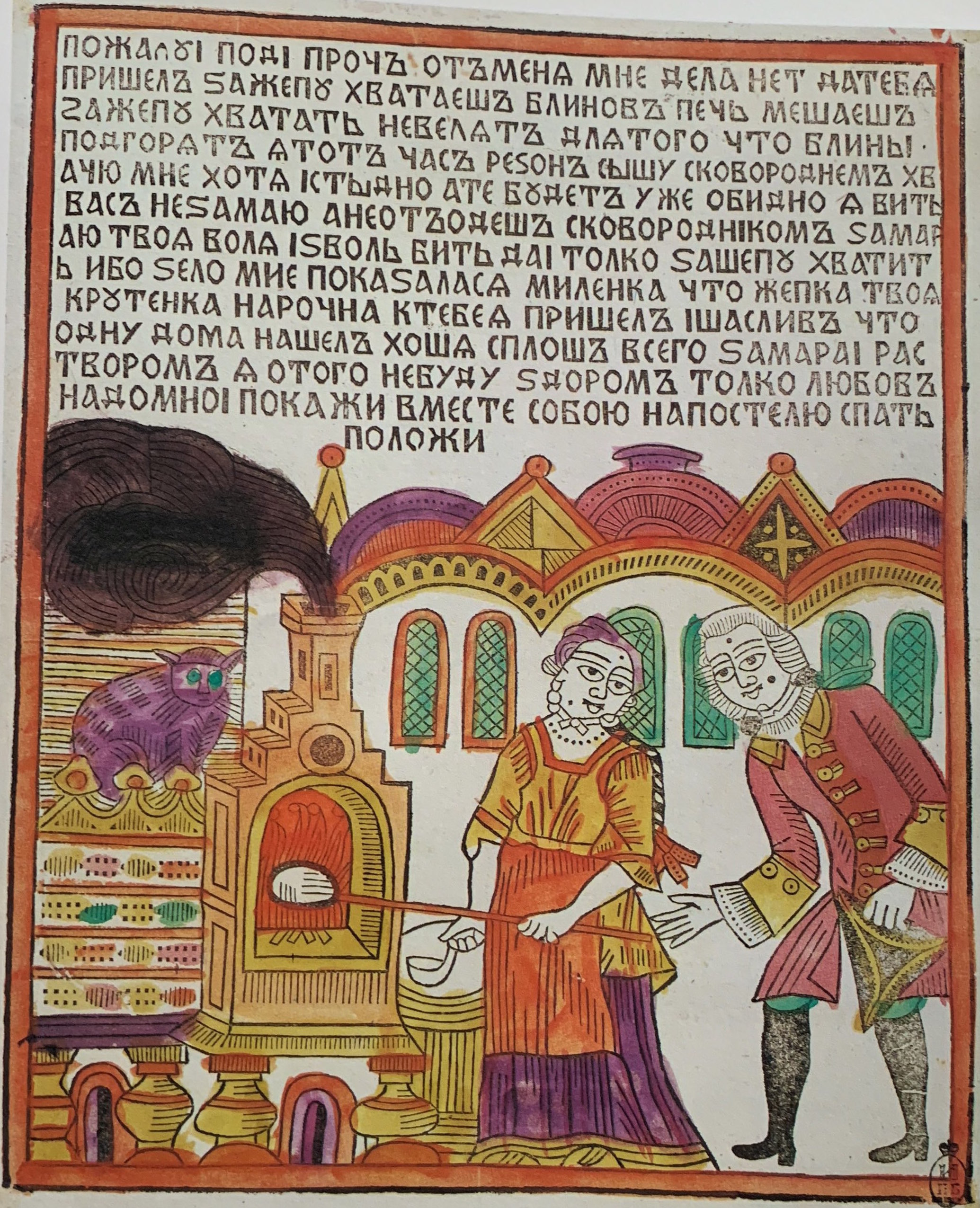
In the twentieth century, the fate of the lubok changed dramatically. While the adjective lubochnyi (lubok-like) had become a pejorative term in the nineteenth century, by the early twentieth century it came to be used as a synonym for “bright, colorful, folk art” (Mishina 1996, 26–27), and the lubki were treasured by young artists seeking to transform Russian art. Members of both Mir Iskusstva (“The World of Art”) and the radical avant-garde embraced the lubok as a native, primitivist alternative to the classical traditions of Western art. Lubok-inspired designs greatly influenced the set designs and choreography for Diaghilev’s ballets, for instance; the eminent choreographer and dancer Mikhail (Michel) Fokine later said: “In dances, poses, groups, and gestures I tried to convey the style of the Russian lubok” (quoted in Sytova 1984, 15).
Back to Top of Page
Bilibin: The “Refined” Lubok
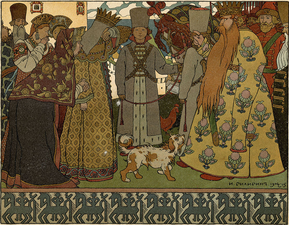
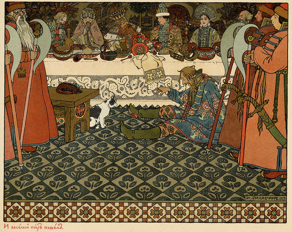
In the Harer Collection, one of the artists with the strongest ties to lubki is Ivan Bilibin (1876–1942), whose early work exhibits an affinity with both Art Nouveau and Russian folk art. (Read more about Bilibin in this essay). Bilibin began collecting lubki during his expeditions to the Russian North from 1902–1904 (Golynets 1981, 8). He later recalled that he had first seen lubki while visiting peasant huts, where he viewed them in their authentic state: “I first saw Russian folk prints (the so-called lubki) when on location; they were sooty and dirty, pasted up to the walls with bread. It was then that I began collecting them.” He described his own work of these years as “an old Russian style, derived from folk prints and old lubok-fairytales, but merely refined” (Bilibin 1970, 59; Bilibin quoted in Golynets 1988, 11).
Golynets notes numerous examples of Bilibin’s compositional style that evoke the lubok: “The large figures are presented in stately, set poses” and the artist “emphasizes the two-dimensional flatness of the page” through his “division of space into planes” (Golynets 1981, 11; Golynets 1988, 11). On page 6 of Bilibin’s illustrations to Alexander Pushkin’s Tsar Saltan (1905), for instance, the stately, monumental figures are lined up in a row towards the front of the frame, with an ornamental border beneath them underscoring the flat, decorative quality of the page. On page 17, meanwhile, the drunken figure sprawled on the floor evokes the atmosphere of nineteenth-century lubki, where the theme of drunkenness was common (Farrell 1980, 143–47).
Back to Top of Page
The Lubok and the Futurist Book
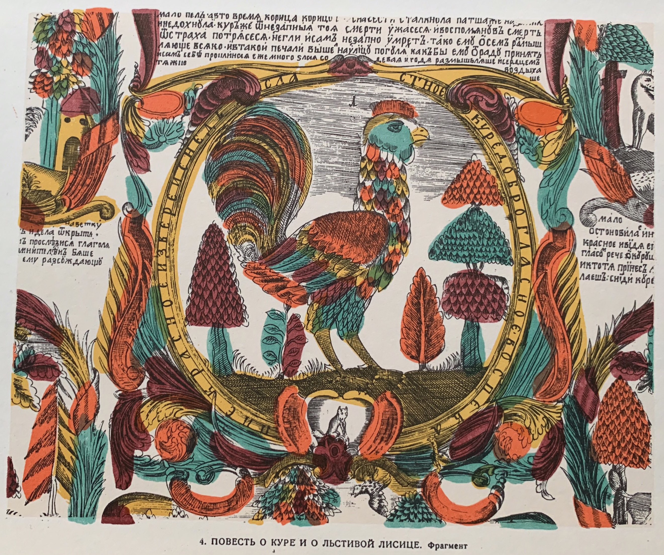
The lubok heavily influenced radical artists such as Mikhail Larionov, Natalya Goncharova, Vasily Kandinsky, and Kazimir Malevich early in their careers (Sytova 1984, 15; Norris 2006, 165, 239nn4–6). Larionov himself organized two exhibitions of lubki in 1913 (Kovtun 1996a, 180). The lubok also served as inspiration for the innovative series of handmade Futurist books created in the early 1910s by Larionov, Goncharova, Aleksei Kruchenykh, and others, who used rubber-stamped or stenciled lettering that “resembled the quaint woodcut letters of eighteenth-century lubki” (Parton 1993, 84; Gourianova 1999, 97–120; Compton 1978, 67–86). These artists often used a coloring technique that was “common in the lubok, in which colored spaces do not coincide with the contours of the drawing but go beyond the boundaries of the lines” and creates “a Cubo-Futurist dislocation of forms, time, and rhythm” (Gourianova 1999, 98, 104–5).
Back to Top of Page
The Today Collective (Сегодня)
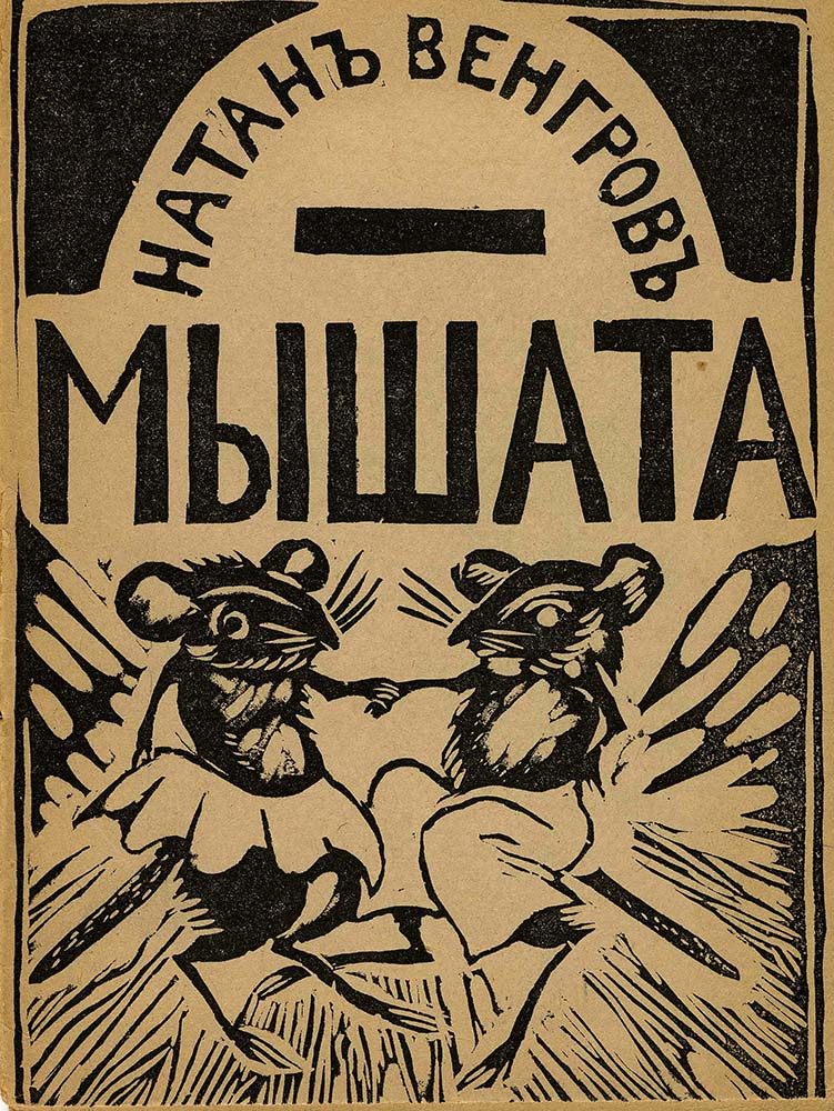
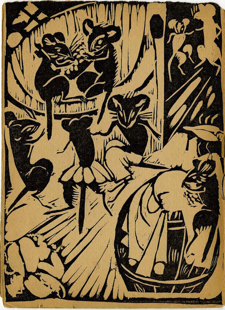
In the Harer Collection, another prominent example of an artist working within the lubok tradition is Vera Yermolaeva. Yermolaeva (1893–1937) was a significant figure in avant-garde artistic circles, associated with both Suprematist and Futurist groups: she later worked as director of the Institute of Practical Arts in Vitebsk alongside Marc Chagall and Kazimir Malevich, and she was also a founding member of the innovative artistic group UNOVIS. Right after the Revolution, from 1918–19, she led an innovative artist’s collective called “Today” (Сегодня), which followed in the footsteps of both the lubok and the avant-garde Futurist books, with an emphasis on Cubist dislocation, Neo-Primitivism, lubok-inspired form and color, and a rough, handcrafted quality. The “Today” Collective, the first significant group of Soviet artists to focus on children’s book design, published a series of limited-edition eight-page books, “hand printed from linoleum blocks,” and “hand-colored, in the manner of lubok pictures” (Steiner 1999, 13; Kovtun 1971, 34). Their connection with the lubok is particularly strong; as Fomin points out, they “recreate the compositional structure characteristic of the lubki” by “depicting their topics dynamically” and “grotesquely accentuating the features of their heroes” (2009a, 161). The Today books also evoke “Cubist principles of organizing space” (Fomin 2009a, 161), and foreshadow Constructivism with their “dominance of unstable diagonal lines over the usual spatial coordinate axes” (Steiner 1999, 14).
Back to Top of Page
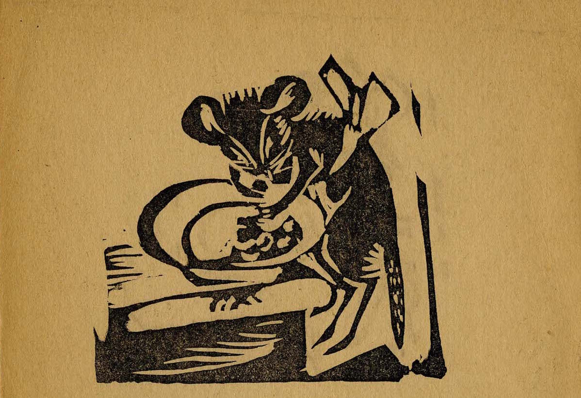
The Harer Collection includes a particularly charming and distinctive example of the “Today” Collective’s works: Baby Mice (Мышата, 1918), which contains engraved illustrations by Yermolaeva, along with a short text in rhymed stanzas written by Natan Vengrov (1894–1962). This thin book, with only three illustrations and three pages of text, printed on rough brown paper, evokes the primitive, handcrafted style of an old chapbook. It tells the story of a group of baby mice who play at night when everyone else in the house is sleeping. The mice are thrilled to discover hard crusts of sukhari (approximate translation: dried, hardened toast), and celebrate with a feast and dancing. In Yermolaeva’s illustrations, the link to the lubok comes to fore. On page 2, the image of the dancing, rowdy mice evokes the folk celebrations found in lubki. The mice festivities take on a transgressive, carnivalesque quality: the underdogs (in this case, mice) have temporarily reversed the hierarchy of power. Povelikhina and Kovtun argue that the images in this book and Yermolaeva’s other works were also influenced by the advertising shop signs (vyveski) of early twentieth-century Russian establishments, which they describe as “modern urban pictorial folklore” and were an object of particular fascination for the avant-garde of that era (1991, 153, 158–59).
Back to Top of Page
The Bolshevik Poster Meets the Lubok
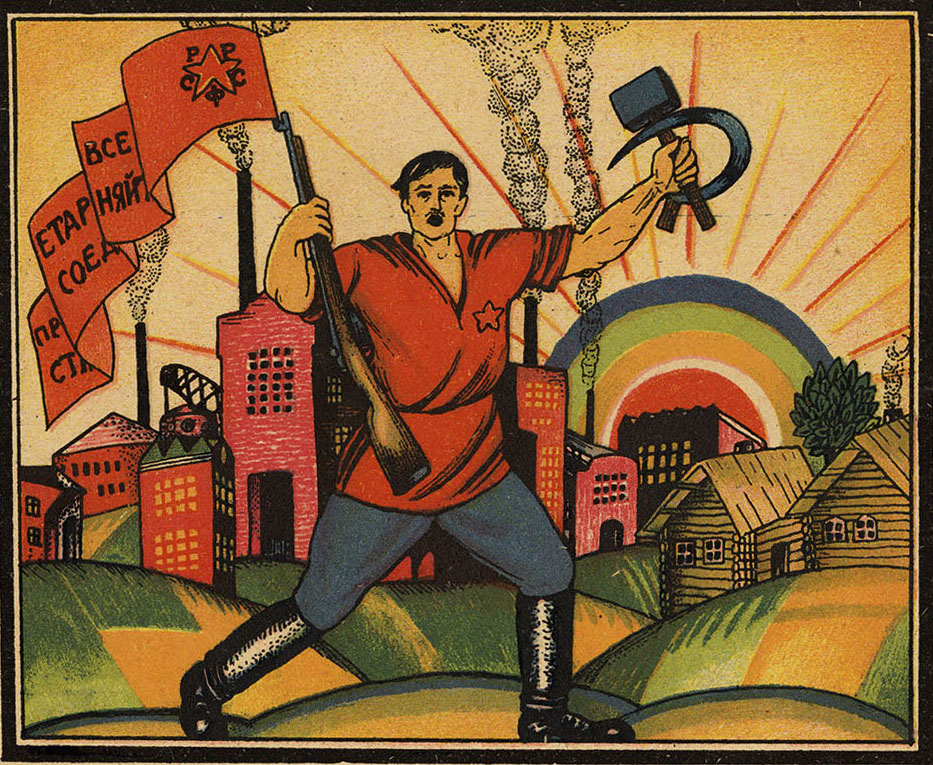
In the early Soviet era, one of the clearest continuations of the Russian lubok developed in the form of the propaganda poster, which invoked both the “boldness, energy, humor, and popular appeal” (White 1988, 1–3) of the lubok, and its propagandistic function (Norris 2006, 4). Artists such as Dmitry Moor and Vladimir Mayakovsky, who recreated contemporary versions of the lubok for the Moscow Publishing House called “The Modern-Day Lubok,” later channeled their experience with the lubok into the creation of the early Bolshevik propaganda poster. (Read more about Mayakovsky and the ROSTA Window posters here.) Moor (1883–1946; pseudonym of Dmitry Stakhievich Orlov) was a particularly prominent Soviet poster artist, and he created one of the most famous Soviet posters of the era, the world-renowned Did You Volunteer? (Ты записался добровольцем?; 1920), which depicts a Red–Army soldier pointing his finger at the viewer. He was interested in lubki early on; he created “patriotic lubki” during World War I, and some of his Soviet-era posters seem like modern renditions of lubki. He also had a particular fascination with Russian icons, especially their composition, narrative techniques, and use of color, and later said that icons “lay at the foundations of my own work” (White 1988, 6–7, 43–44).
Back to Top of Page
Red-Army Alphabet
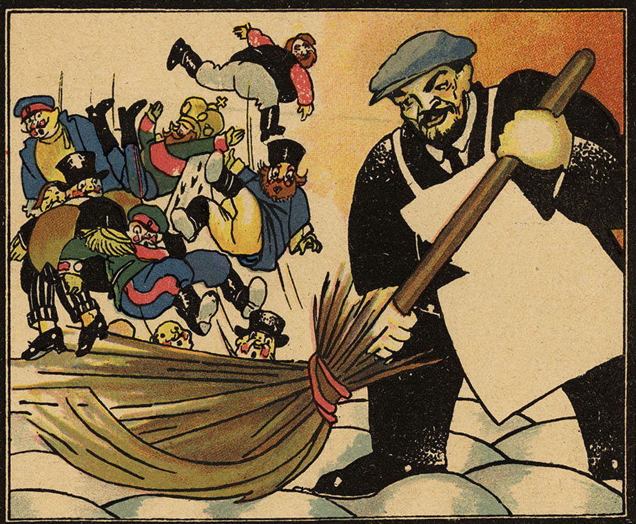
When Moor created his first children’s book, Red-Army Alphabet (Азбука красноармейца, 1921), which is part of the Harer Collection, these diverse influences (posters, icons, and lubki) all came to the fore. In this book, as in many of his posters, he used a “before and after” motif to indicate the contrast between pre-revolutionary corruption and the idealized new Soviet world (White 1988, 43–51). He repeatedly juxtaposes corrupt priests and bourgeois capitalists with the hardworking proletariat. On page 9 of Red-Army Alphabet, the unusually broadened foreground image of Lenin, his size amplified to reflect his political importance, is juxtaposed to the symbolically and literally diminished capitalists and royalists whom he is sweeping away with his broom. This recalls the non-mimetic, symbolic usage of size and placement in both medieval art and the Russian lubok. Throughout the book, the exaggerated features of the figures, accentuating their negative or positive value, evoke the rough, cartoonish quality of lubok satire. In contrast to Bilibin and other members of the Mir Iskusstva movement, who sought to “ennoble” the lubok tradition, as seen above, “Moor was drawn to its crudeness and vivid intensity,” and in Red-Army Alphabet he reproduced the “extremely simplified language” and “grotesquely-satirical and naïvely-heroic figures” found in lubok pictures (Fomin 2009c, 228).
Back to Top of Page
