“Go into the factory, where the real body of life is made…This route is called Constructivism”—Constructivist Exhibition Catalog, January 1922 (quoted in Lodder 1983, 2)
“Go into the Factory”
In the 1920s, a particularly prevalent type of Soviet children’s literature was the “production book,” which focused on the world of workers, industry, and technology. “The ‘production book’ methodically explains industrial processes to children . . . while celebrating the achievements of machines and laborers” (Miller & Nafpaktitis 2007, 30). In practice the production book took a wide variety of forms, depicting topics such as machines, transportation, workers’ daily lives, and details of agricultural production, while also sometimes taking the form of “how-to” books that showed children how specific objects are made. These how-to books exemplified the Soviet educational project: teaching the child, i.e. the future laborer, the details of his/her future realm: “Productivist art was supposed to be fully integrated with life, providing practical guidance to the world of knowledge and objects” (Oushakine 2016, 191). (For more on the Soviet production book, see Fomin 2009d; Steiner 1999, chap. 3; Rosenfeld 2003, chap. 3).
The production book was also connected to Constructivism, a movement spearheaded in 1921 by artists such as Alexei Gan, Alexander Rodchenko, and Varvara Stepanova. The Constructivists called for the artist to “go into the factory, where the real body of life is made,” and promoted the “merging of art and life through mass production and industry” (Constructivist exhibition catalog, Jan. 1922; Lodder 1983, 2–3). They also envisioned a new combination of “abstract constructions,” as found in pre-revolutionary art, and the “constraints of industrial production” (First Working Group of Constructivists, 1921; Lodder 1983, 3).
The Children’s Book as How-To Manual
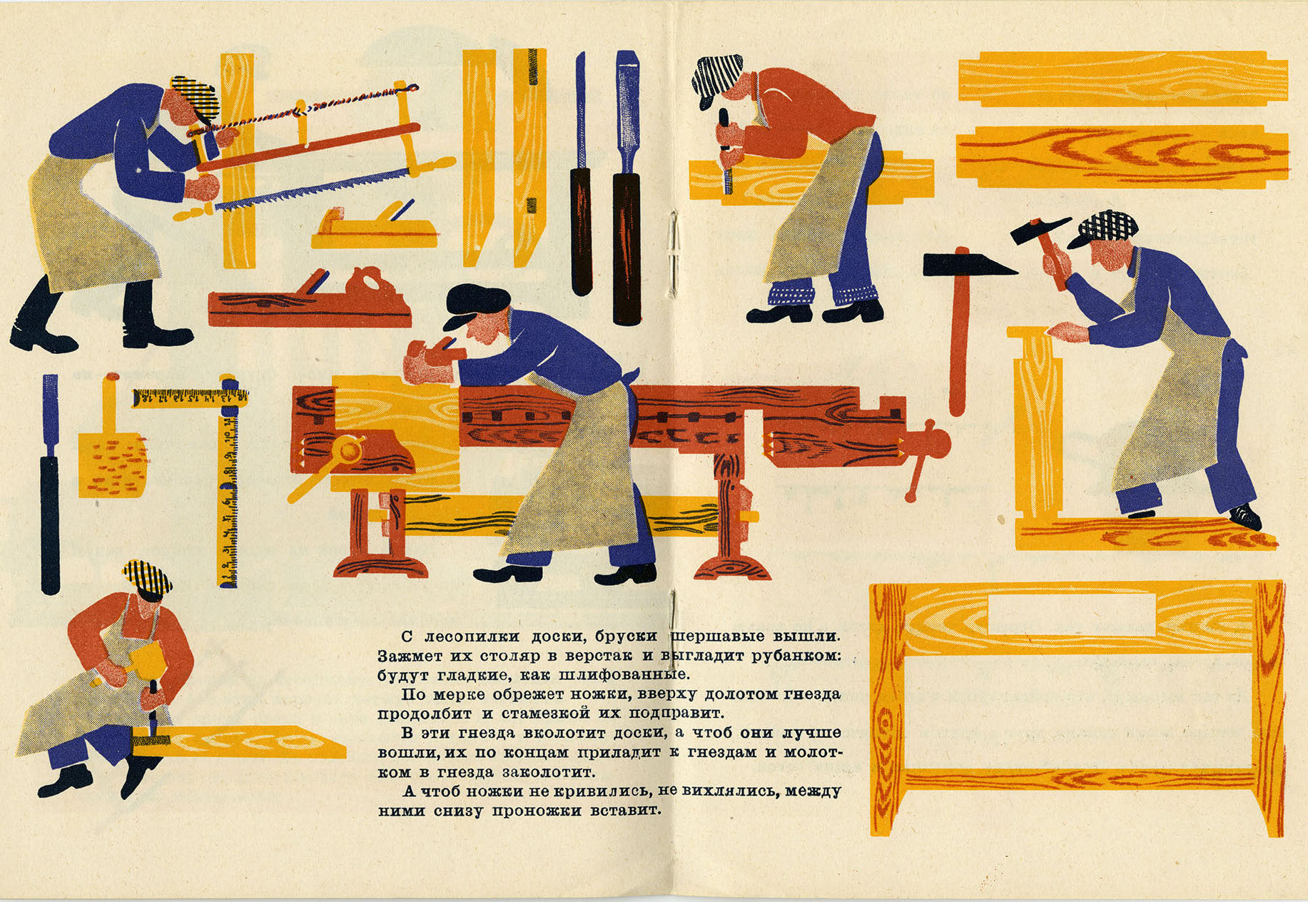
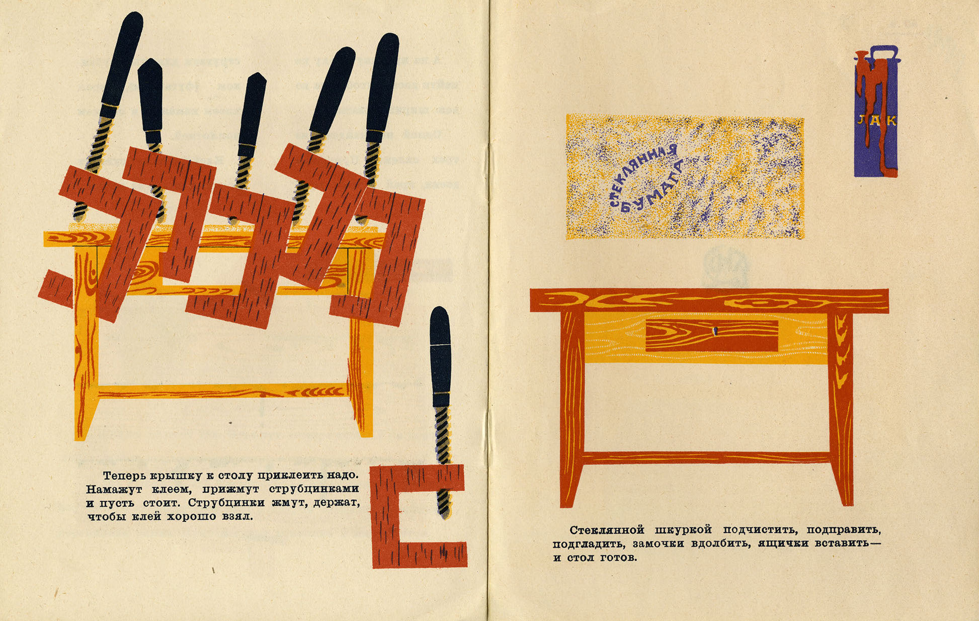
One of the most striking production books in the Harer Collection is The Table (Стол, 1926), illustrated by Yevgeniya Evenbakh (1889–1981), an artist who was influenced by Vladimir Lebedev and worked with him at the Children’s Department of Gosizdat (the State Publishing House). Evenbakh’s work reflects motifs from folk art, advertising signboards, and the medieval architecture and palette of old Russian cities such as Novgorod: “Novgorod became the basis for all my work. It was in Novgorod that my children’s books were born” (Evenbakh quoted in Rosenfeld 2003, 256).
Evenbakh worked from live models in carpentry workshops (Rosenfeld 2003, 259) and her depiction of the carpentry process is highly specific, including details such as the multiple saws and other tools needed to create the final product. At the same time, the human workers are schematized types with simplified features, as in Lebedev’s works. On some pages, the images float in a field of white space, divorced from context or perspective. “The workers’ repetitive rhythm and the positioning of the drawings as strips parallel to the text are reminiscent of an ornamental frieze” (Rosenfeld 2003, 259). The bright orange and red palette evokes the colors of the Russian lubok (illustrated broadside), and imparts a feeling of folk art to these images.
(Read about another of Evenbakh’s works, On the River, below.)
Back to Top of Page
Objects Without People
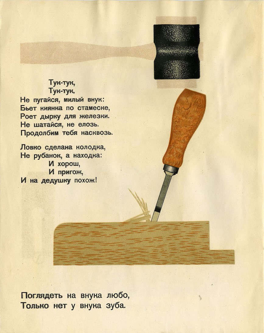
Evenbakh’s Table particularly impressed Lebedev, and it influenced his own work (Rosenfeld 2003, 259), especially his illustrations for Marshak’s poem about the creation of a carpenter’s plane, How a Plane Made a Plane (Как рубанок сделал рубанок, 1927). In this book, Lebedev’s illustrations are striking in their complete elimination of the human: the universe of objects functions independently, with the pragmatic tools of the working world serving as anthropomorphized heroes on the page. The notion of tools as protagonists is highlighted by their position in a white field of space. Steiner has noted that, for avant-garde artists of this era, “aesthetic mastery of the world was a mastery of things” and thus they divorce objects from their context, positioning them instead “on the white field of a page, in a neutral display window” (1999, 151–52).
When the old “grandfather plane” realizes he has come to the end of his days, he asks the saw, chisel, and mallet to create a new wooden plane to replace him. They magically accomplish their tasks without the assistance of human hands, as on page 10, when the mallet independently pounds on the mortise chisel to create a hole for the metal blade of the plane: “Tuk–Tuk. Tuk–Tuk. / Don’t be afraid, sweet grandson: / The mallet strikes against the chisel, / And digs out a groove for the blade.”
As Fomin points out, “While Marshak endows the objects with personalities and human speech, Lebedev focuses only on their physical characteristics (texture, color, volume) and their function within the world of work.” By removing the human workers, Lebedev draws the child more powerfully into that world: “You see the objects with your eyes, but feel them with your hand . . . . [Lebedev] didn’t want children to look at workers; he wanted them to be drawn to real, solid tools instead of toys” (Fomin 2009b, 2:14; Yury Gerchuk quoted in Fomin).
Back to Top of Page
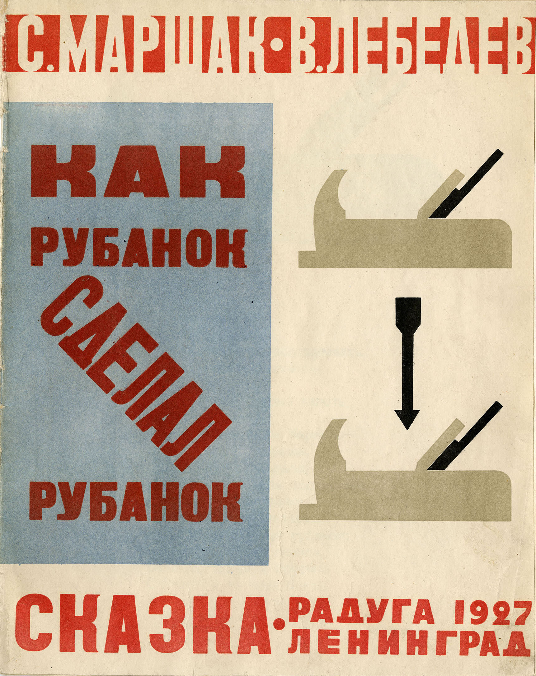
The cover of Lebedev’s How a Plane Made a Plane is particularly notable because the red typography and diagonal position of the word “made” (сделал) recalls both Lebedev’s own ROSTA posters and the Constructivist style pioneered by Alexander Rodchenko and El Lissitzky, as discussed in the previous essay. The diagonal word “made” underscores the idea of “making” or “constructing,” itself the notion at the heart of the Constructivist project. The diagonal letters also parallel the angle of the blade on the plane itself, seen on the right side of the page. Lebedev thus innovatively translates the abstracted, avant-garde diagonal form into the concrete world of labor and tools.
This cover also visually evokes El Lissitzky’s groundbreaking children’s book, About Two Squares (Про два квадрата, 1922), and his renowned poster, Beat the Whites with the Red Wedge (Клином красным бей белых, 1919), which utilizes red-and-white geometric shapes, stenciled lettering, and diagonal words to emphasize the “Red Wedge” of the Bolsheviks.
Back to Top of Page
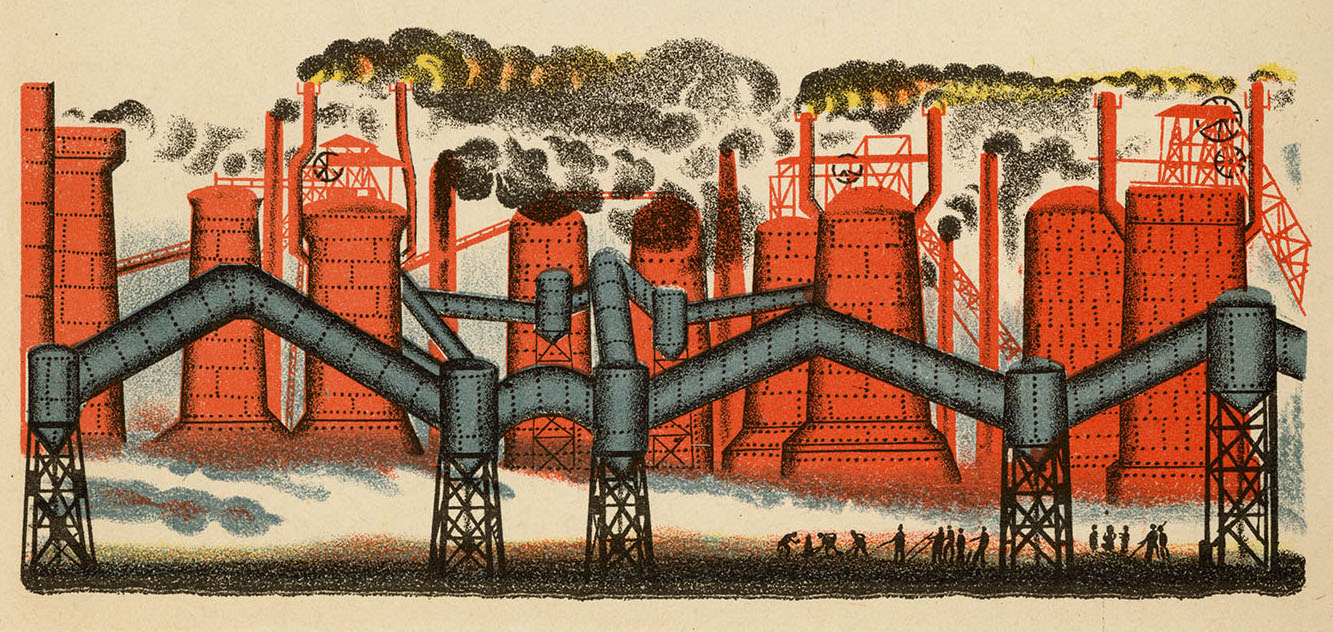
The Geometric Factory
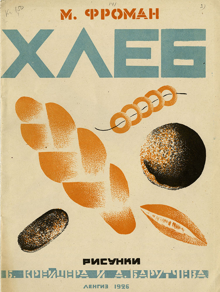
Application of the same idea of “how things are made” to an agricultural context is seen in Bread (Хлеб, 1926), written by Mikhail Froman (1891–1940), and illustrated by Boris Kreister (1904–1979) and Armen Barutchev (1904–1976). As is the case with Lebedev’s How a Plane Made a Plane, stenciled typography on the front cover heightens the sensation of avant-garde modernity.
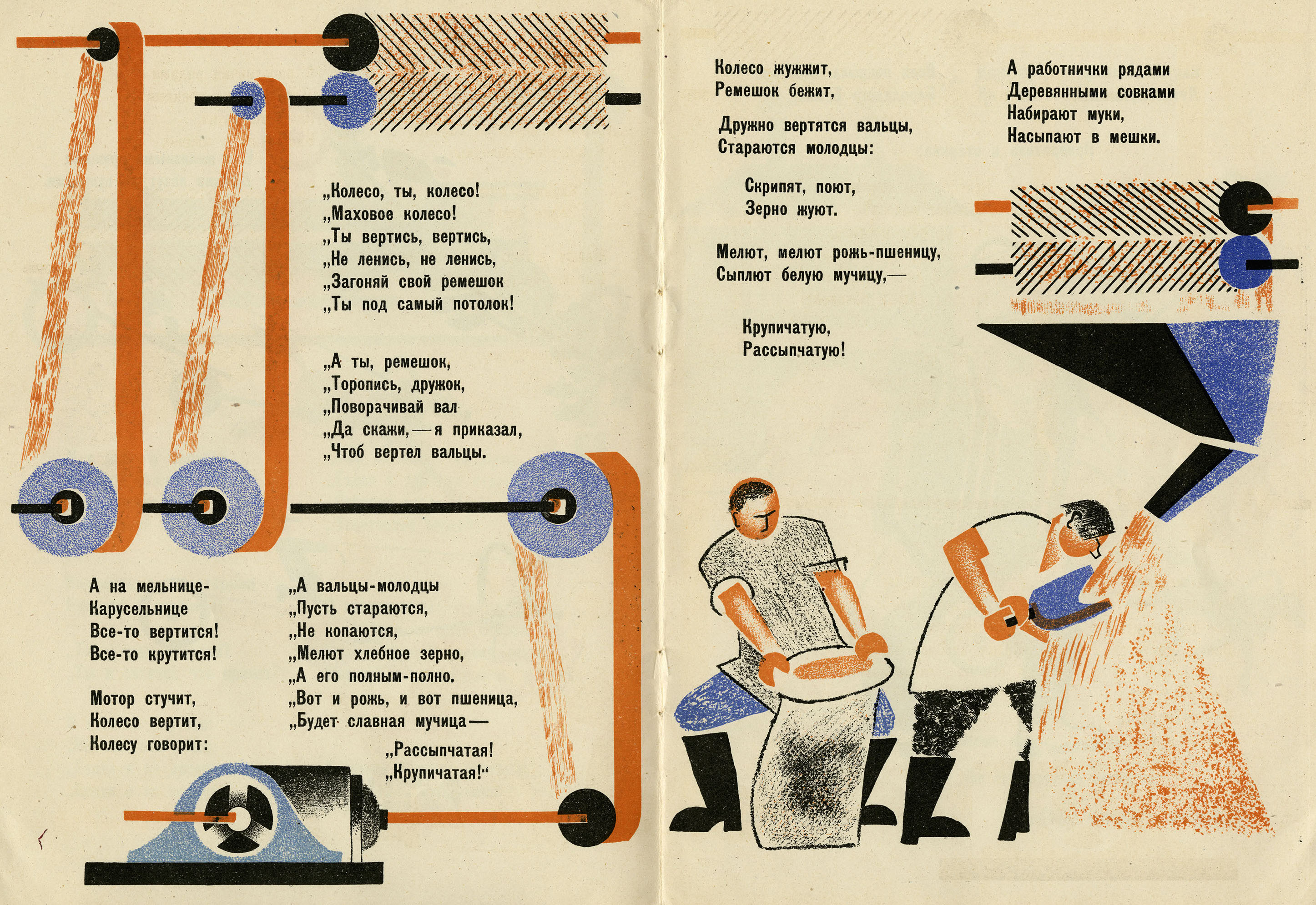
The text details the process of bread production, including the gathering of grain from farms, the milling of grain into flour, and the baking of the dough into bread, pretzels, and buns, which are eaten at the end of the book by Young Pioneers. On pages 4–5, the workers are depicted with schematized and simplified facial expressions, while the machines are reduced to a series of vertical lines and geometrical shapes (the symmetrical blue circles of the drive-wheels; the broad, vertical stripes of the belts; the thin black lines of the shafts). This heightens both the Constructivist and production-book nature of this work: it is both “practical” and avant-garde, highlighting the ways in which the factory fits into an abstracted, geometrical view of reality.
Back to Top of Page
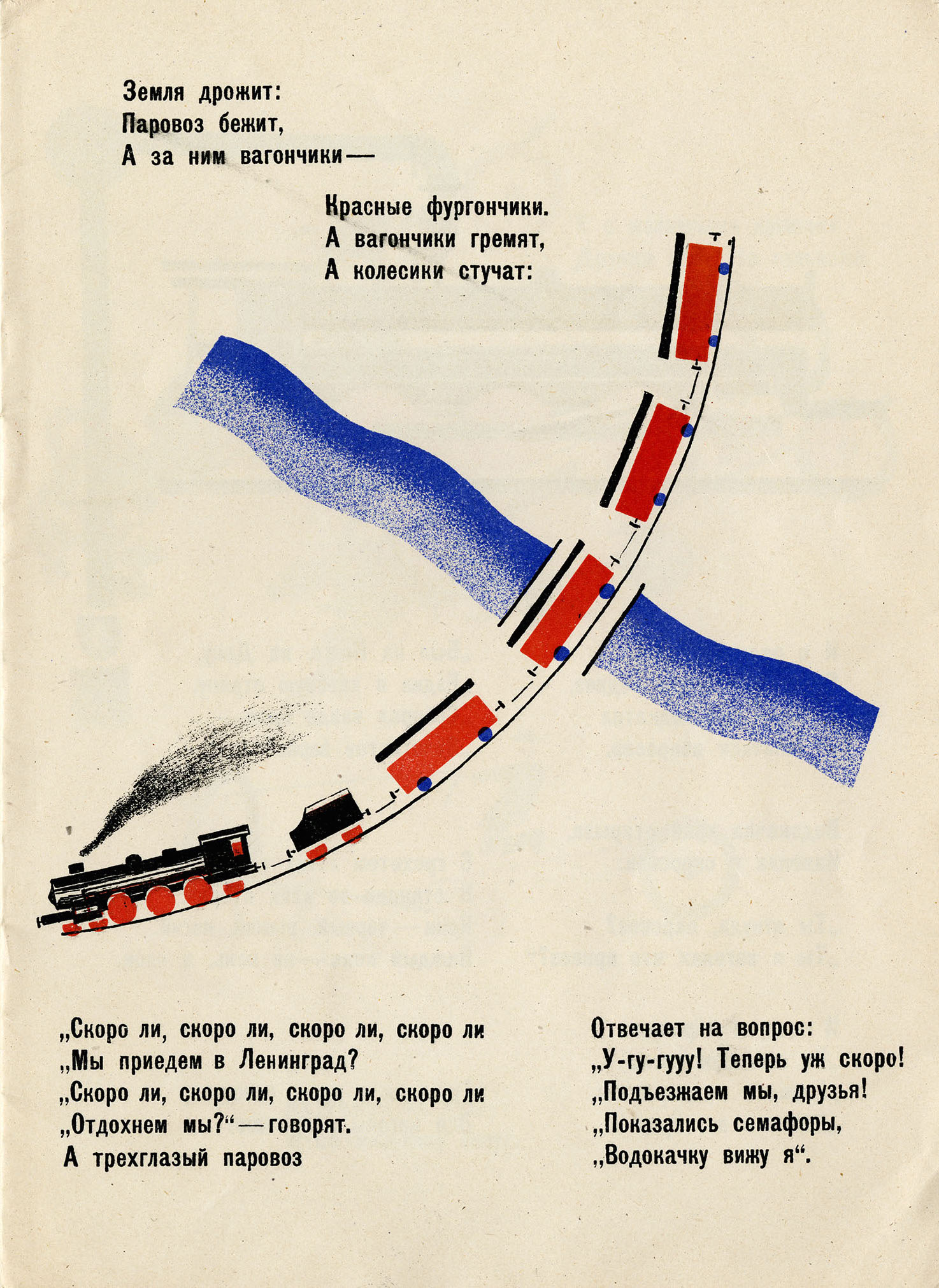
Page 1 of Bread foregrounds the means of delivery (a train delivering grain). The full-page illustration is reduced to a beautifully simple intersection of crossed lines. The curved arc of the black-and-red steam engine intersects the river, which itself dissects the very center of the page, its streaming waters reduced to their purest, minimalist element: a mere swath of blue.
The locomotive itself, as Steiner points out, is the “hero of the production book” (1999, 115). Marshak, in his autobiography, conjures up the magic of the steam train for this generation: “How amazed we children were in those days by the first steam-engines we saw—black with soot, and with tall chimneys and enormous wheels. They would come flying round corners like veritable devils, with a shower of sparks . . . . And the carriages—green, yellow, and blue—would tap their way along, luring us towards unknown lands” (1964, 41).
Back to Top of Page
Receding Lines of the Train
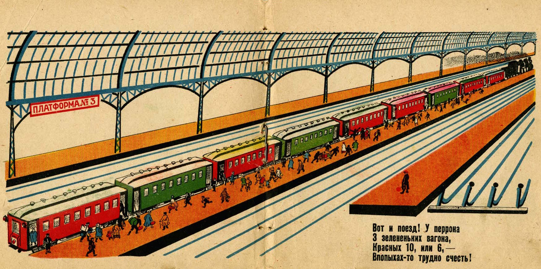
A similar delight in the power of the locomotive is found in Railroad (Железная дорога, 1928), written by Elizaveta Tarakhovskaya (1891–1968), and illustrated by Boris Pokrovsky (1900–c. 1960). On pages 5–6 of this book, the power of the locomotive is expressed through elongated, diagonal lines stretching across the centerfold. The lines recede into a vanishing point located beyond the right-hand side of the frame, suggesting that something unexpected and new awaits the viewer beyond the picture, and emphasizing the feeling of speed and modernity. The first line in the text highlights the excitement: “Here’s the train! At Platform Three: three green train-cars, and ten or six red ones!”
As is the case with other books examined above, the vibrant orange-red palette, evocative of the lubok, dominates. The tiny people scurrying across the orange platform, in their haste to find a place in the red or green cars, seem like an afterthought, subordinate to the geometric precision of the windows dominating the higher ground of the page. These windows evoke the geometry of the iron-and-glass train-shed of European railway stations, themselves the ultimate symbol of modernity, albeit of an earlier era.
(Read about another of Pokrovsky’s works, My Little Book about the Seas and the Lighthouse, below.)
Back to Top of Page
The Lighthouse as Industrial Self
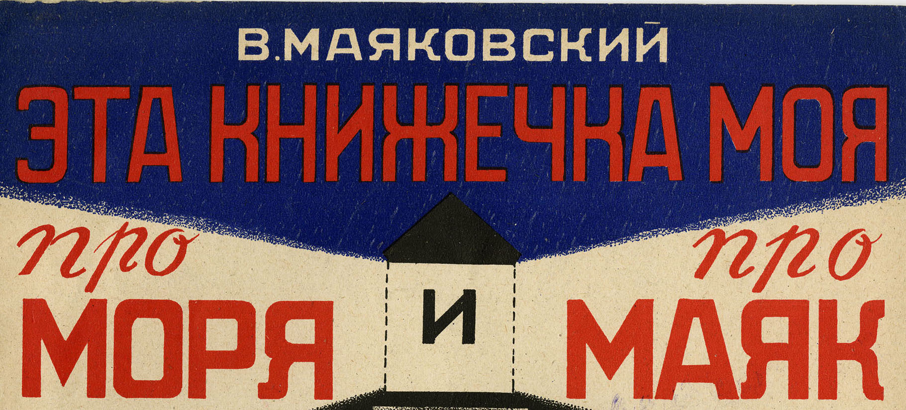
The Constructivist elements of transportation are similarly celebrated in another work illustrated by Boris Pokrovsky, My Little Book About the Seas and the Lighthouse (Эта книжечка моя про моря и про маяк, 1927). Written by the Futurist poet Vladimir Mayakovsky (1893–1930), the most prominent Soviet poet of his era, the book celebrates the labor of devoted Soviet workers tending to a lighthouse, while also self-referentially speaking to the reader with a meta-comment about the author’s role. The underlying joke of the book’s title is the overlap between the word “lighthouse” (in Russian: maiak) and the author’s own name, literally transliterated: Maiakovskii.
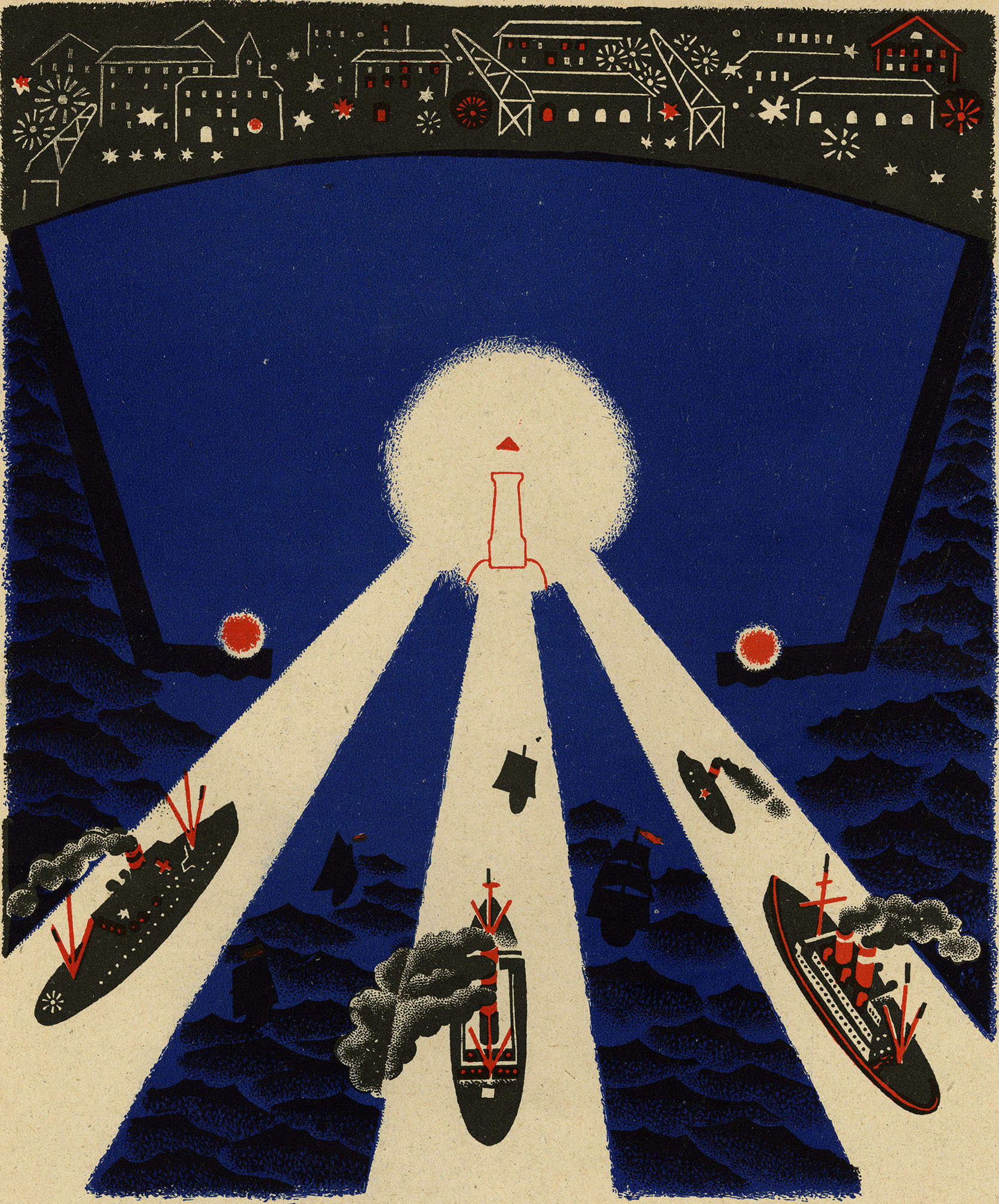
Pokrovsky’s deeply saturated dark blues and reds create a highly appealing, poster-like depiction of boats tossing in the seas and lighthouse-workers tending to them in an almost parental fashion. Throughout the book, the workers labor to bring boats safely home, by mounting the spiral staircase to check the status of the light (page 8) or polishing the lighthouse’s giant lens (page 9).
By the end of the book, the boats have been brought to port, and on page 10 they are presented in a brilliant, geometrically arranged design, the tripartite searchlights creating an icon-like triangle of welcome to the boats that have safely returned from the sea. (For an illuminating discussion on Mayakovsky’s books for children overall, see Weld 2018, 165–79).
Back to Top of Page
The Journey of the Modern Letter
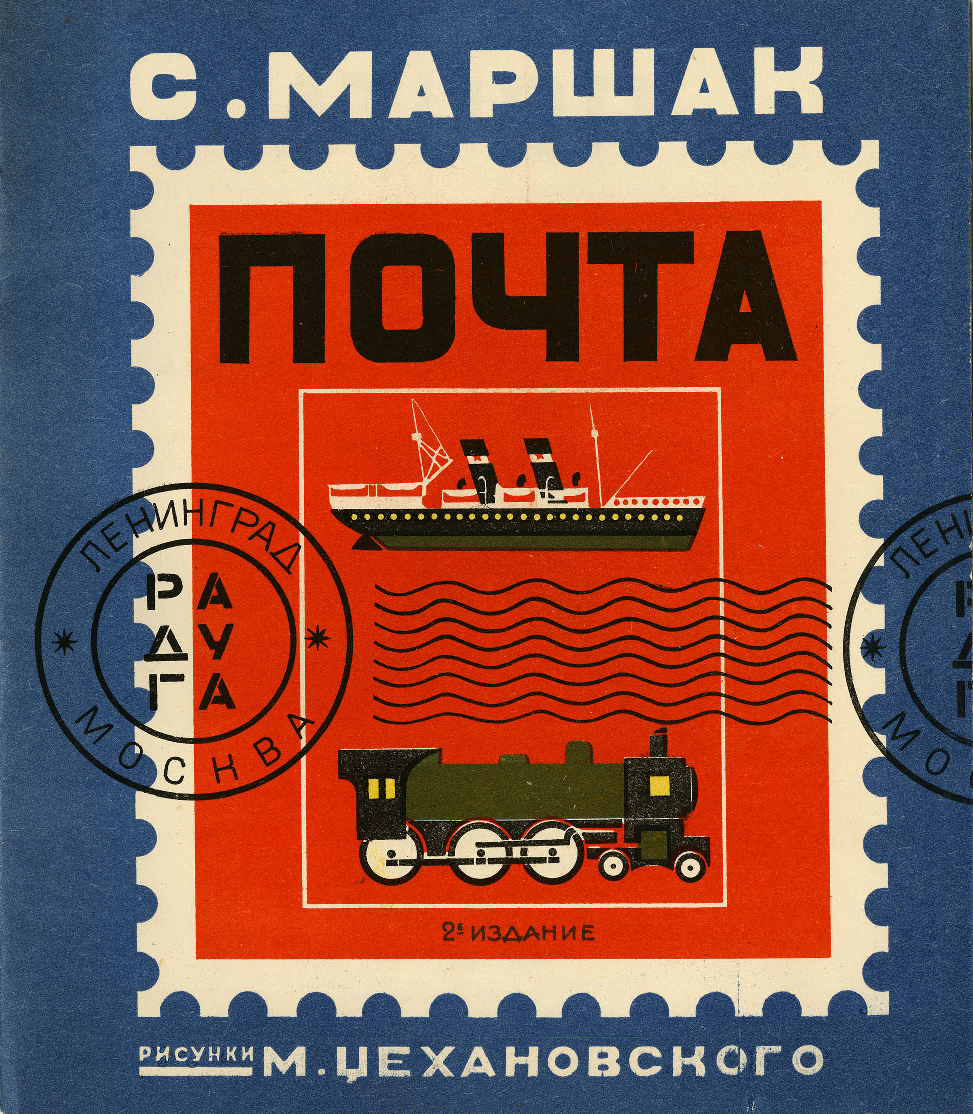
The speed of modernity and technology is expressed through the postal service in The Mail (Почта, 1927), with verses by Samuil Marshak and illustrations by Mikhail Tsekhanovsky (1889–1965). From the outset the book highlights the link between mail and transportation, with illustrations of a ship and a train prominently displayed on the front cover. The cover itself, structured in the form of a postage stamp, hints at the dynamism of a mailed letter, with its witty use of a cancellation stamp that would normally indicate the city of departure, here transformed to depict the publisher’s name and location (Raduga, Leningrad, Moscow). In this way the book becomes the letter itself (i.e. the letter that the book both describes and embodies), revealing to the viewer that it has already left its initial destination, and possibly travelled far and wide.
Back to Top of Page
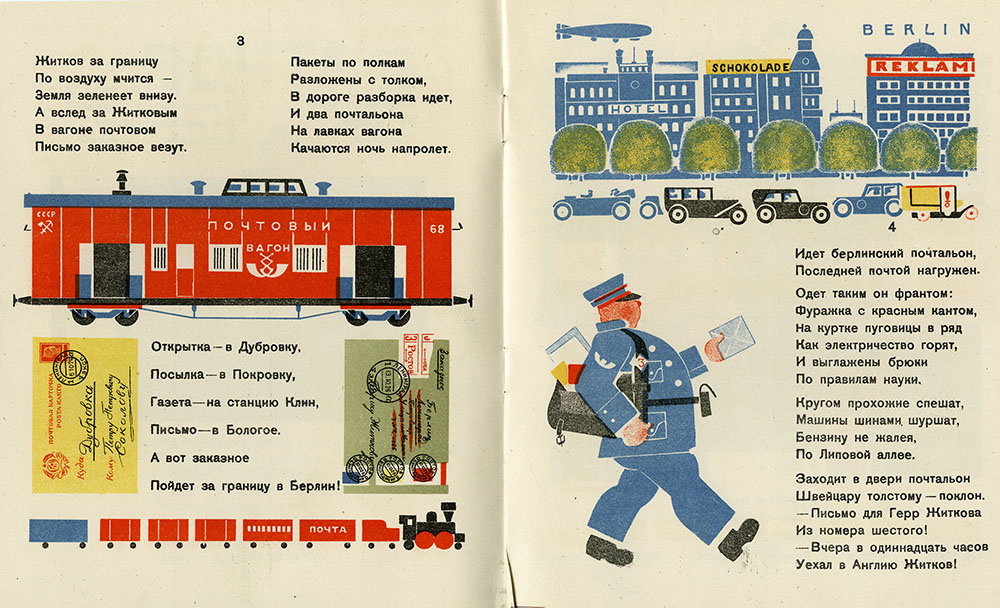
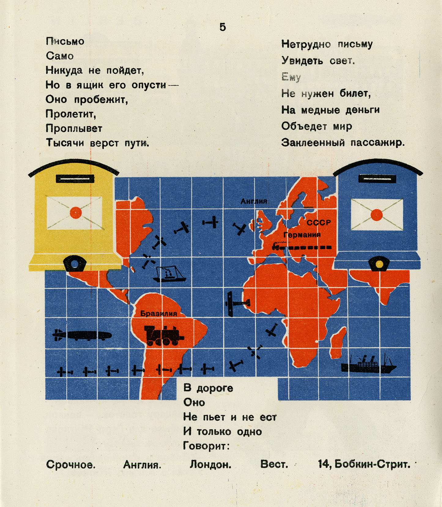
This emphasis on speed and dynamic movement continues throughout The Mail. The letter zips around the world at lightning speed, looking for its intended addressee, with all the confusion inherent to modern technology. It eventually finds its recipient, but only after travelling around the world, mistakenly going to the wrong locations, and stopping at places throughout Europe and South America. On page 3, the postal envelopes, the mail train car, and other segments of the train are symmetrically positioned as colorful rectangles, akin to the geometrization of modern life that we saw in Lebedev’s works. On page 4, the postman in Berlin walks triumphantly forward, “as if urging the reader to turn to the next page” (Rosenfeld 1999b, 186).
The dynamism of the book reflects Tsekhanovsky’s particular interest in speed, technology, and film. He specialized in children’s books on science and technology, and after this book was published he worked primarily as a designer of animated films. In The Mail, Tsekhanovsky’s filmic sensibility is embodied in his creation of a “montage of separate frames” (Steiner 1999, 159; see also Rosenfeld 1999b, 186). Steiner argues that Tsekhanovsky was “the most radical Constructivist artist in children’s books” (1999, 183).
Back to Top of Page
Fishing Nets & Laundry Baskets
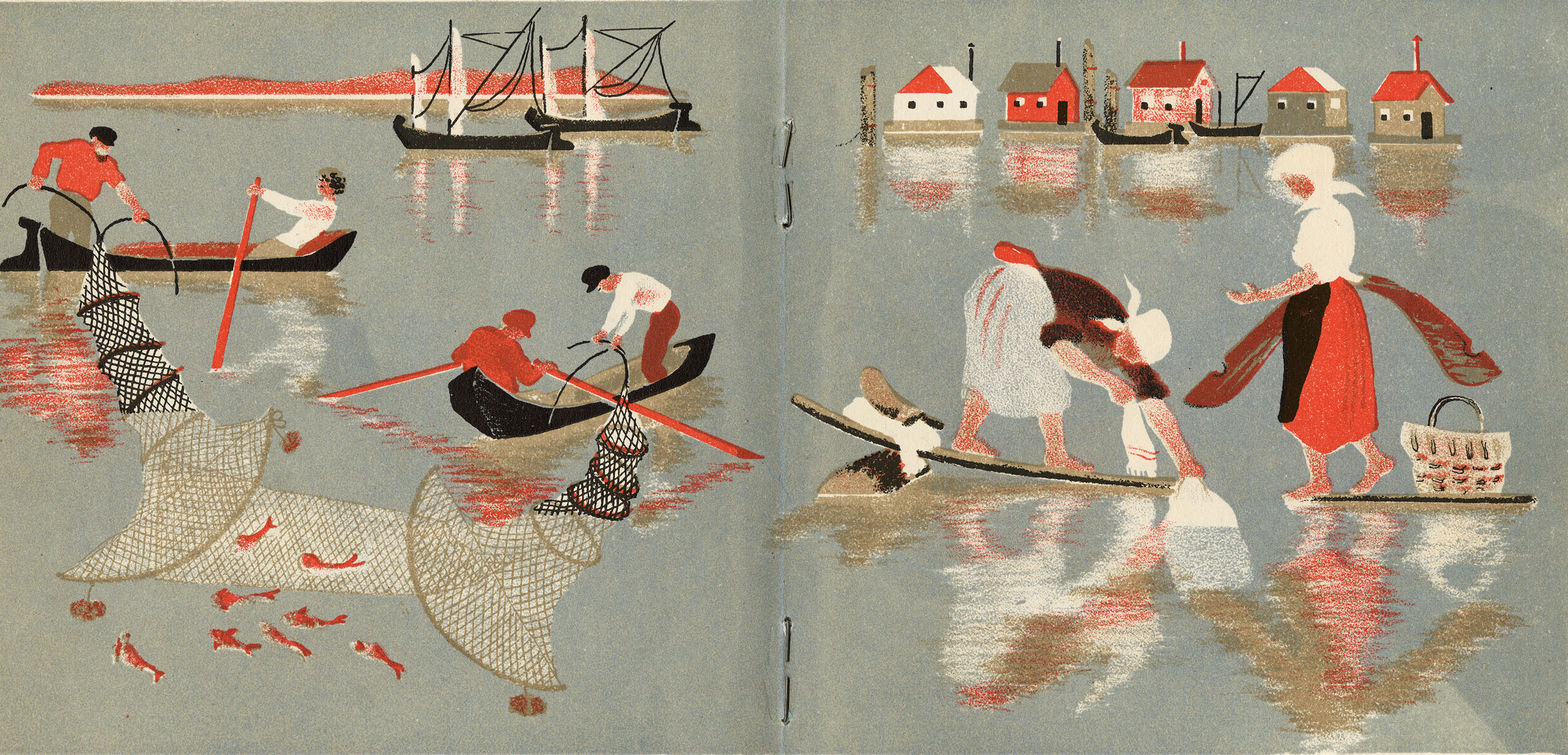
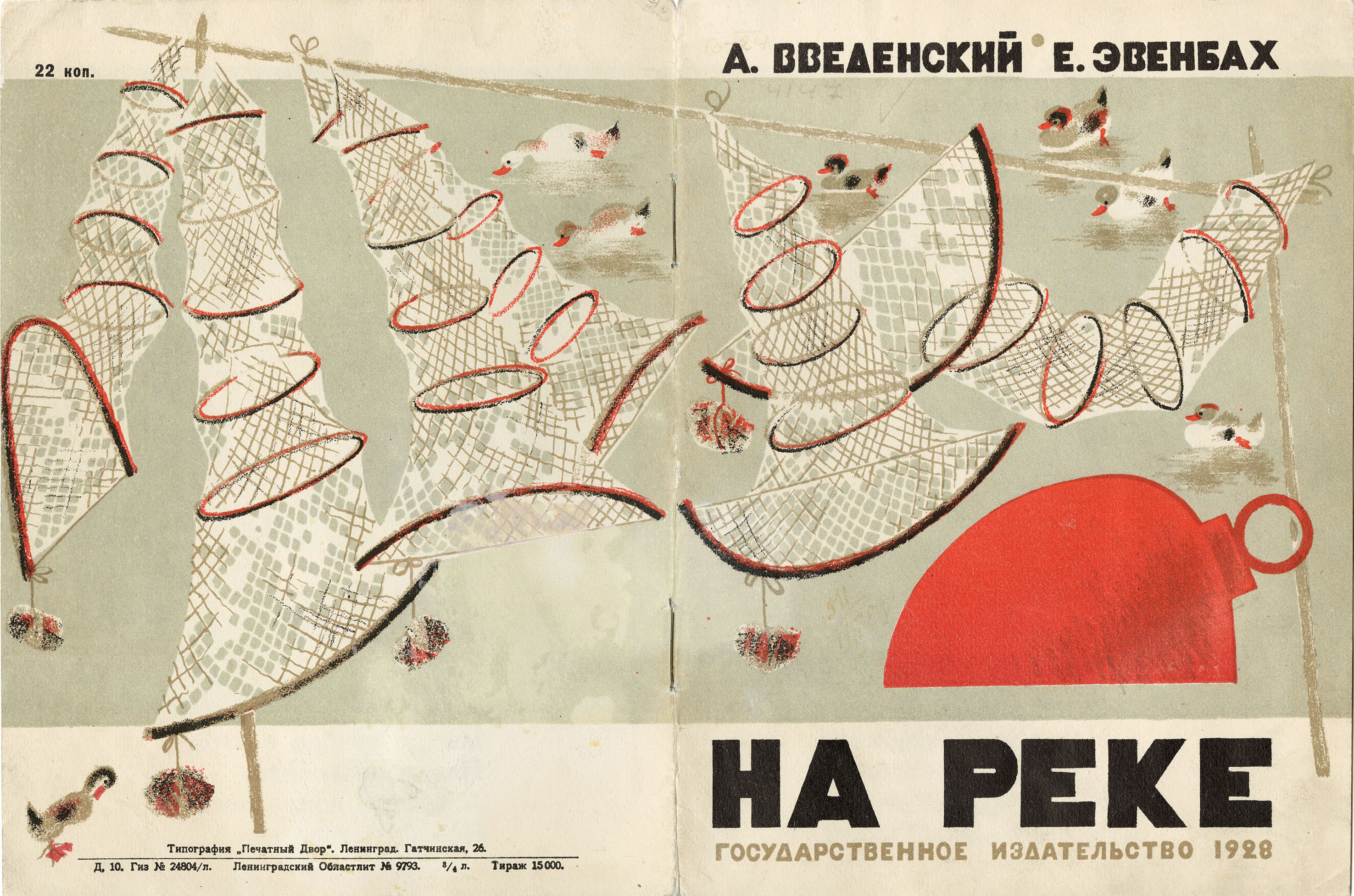
Like other production books, On the River (На реке, 1928) focuses on the world of labor and workers, but with a more meditative and lyrical tempo. The book was illustrated by Yevgeniya Evenbakh, whose book Table was discussed above, while the text was written by the poet Alexander Vvedensky (1904–1941), a member of the radical avant-garde group OBERIU (ОБэРИу; Union of Real Art). Vvedensky’s text, consisting of short, playful, rhymed verses, celebrates life on the river in a lighthearted way, not always corresponding to the illustrations. The poem is written from a child’s perspective, and includes concrete details of children’s experience of the river, such as swimming and playing in the water. The words relate the boats, laundry, and other objects directly to children’s lives.
By contrast, the illustrations emphasize the adult world of industry and transportation, and omit the references to child’s play found in the text. Evenbakh’s images emphasize the laborers’ tasks, such as sawing logs, doing laundry, and pulling fishing nets. Even so, her muted tones, soft contours, and watery reflections endow this book with a gentler atmosphere than other production books discussed above; here the pace seems more akin to the slow lapping of the river.
Back to Top of Page